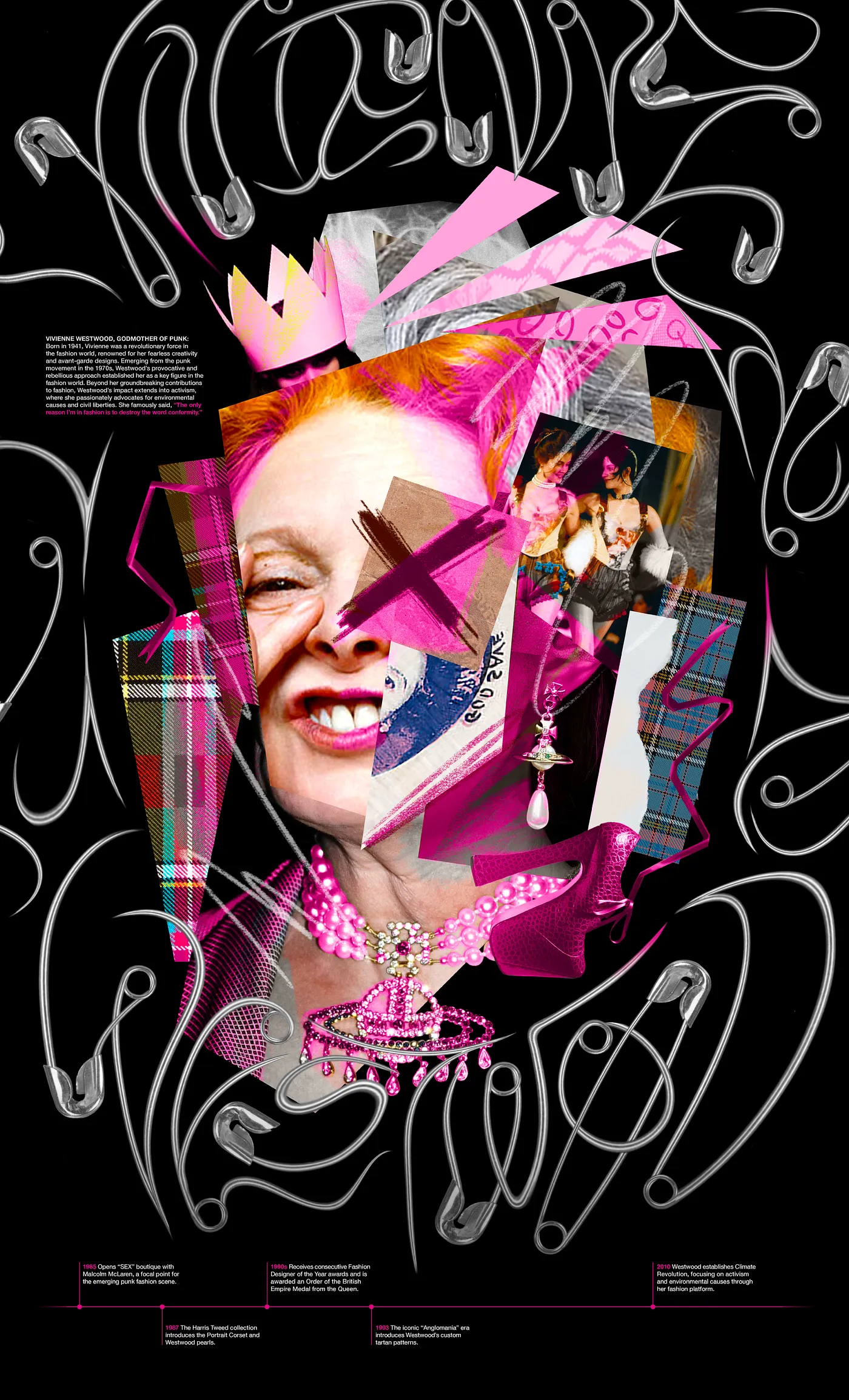
Vivienne Westwood, Design Hero
Timeline ········· 9 weeks
Tools ······ InDesign, Photoshop, Illustrator, After Effects, Figma
Role ······· Brand Design, Asset Creation
Various mediums centered around the work and life of incredibly influential fashion designer Vivienne Westwood.
Tools ······ InDesign, Photoshop, Illustrator, After Effects, Figma
Role ······· Brand Design, Asset Creation
Various mediums centered around the work and life of incredibly influential fashion designer Vivienne Westwood.
Asset 1: Motion


Asset 2: Poster
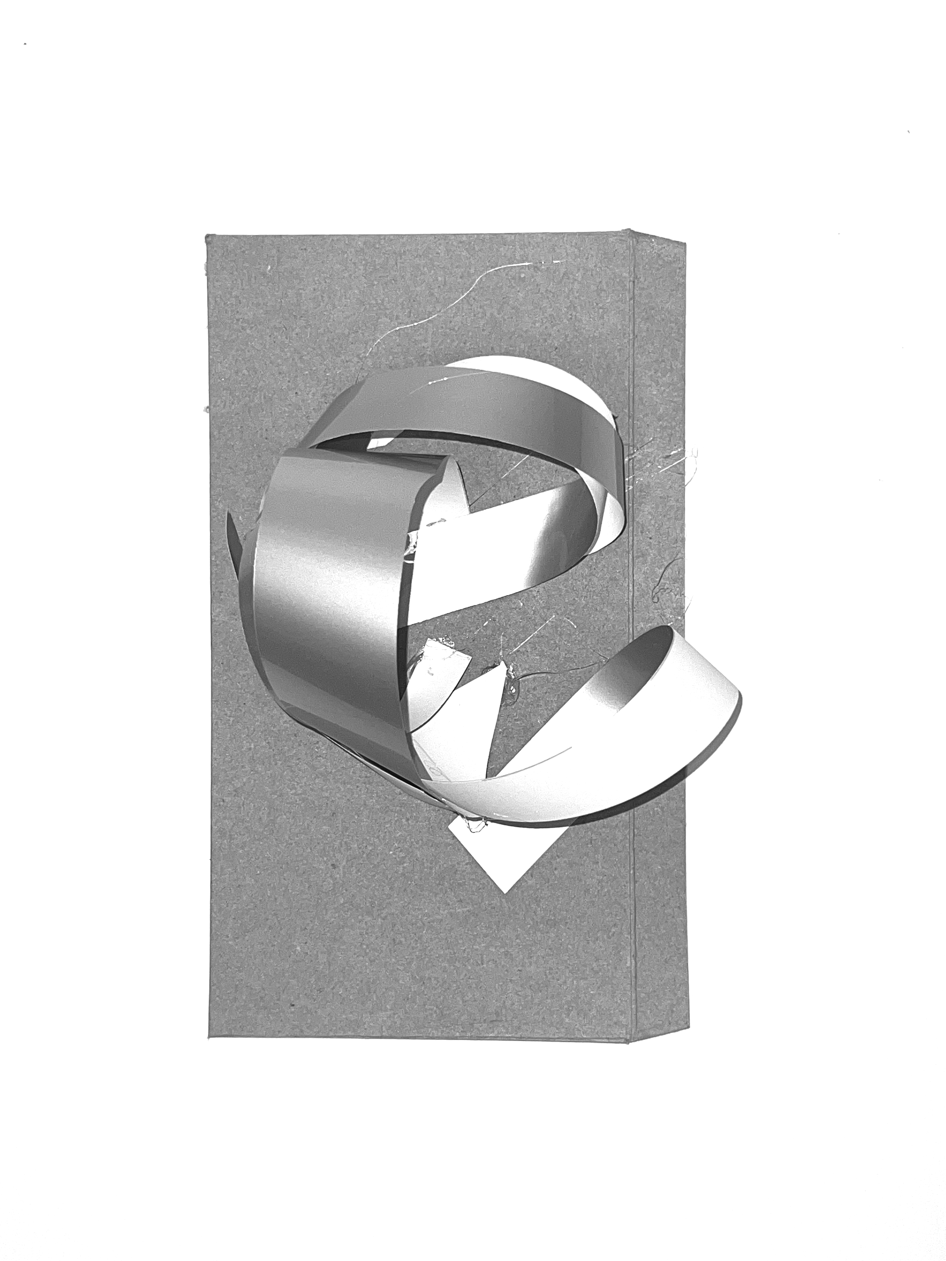
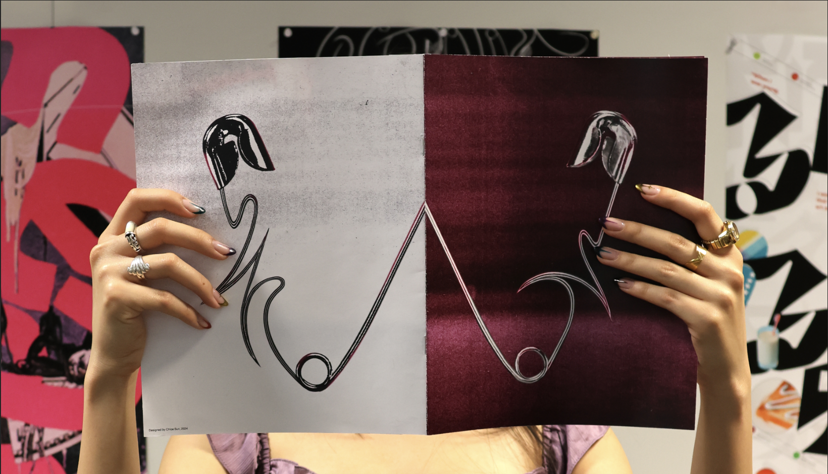
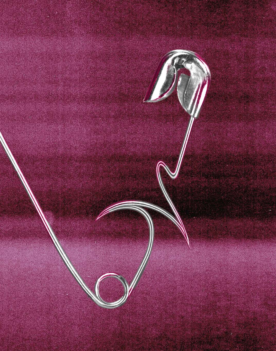
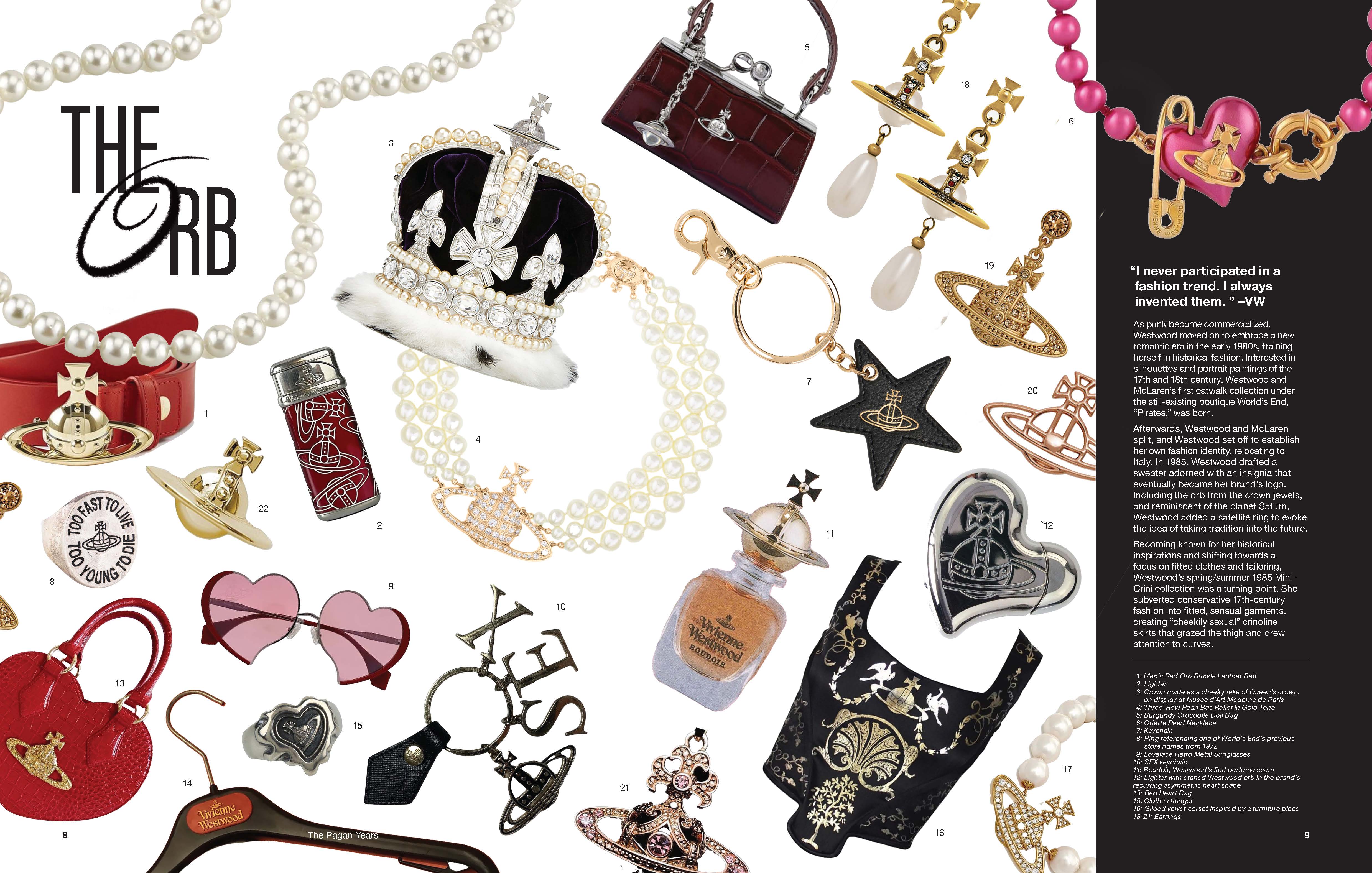
Safety pins became the reference point for this project given its symbolism—it was an important part of punk clothing/representing punk values, and although it was sharp and hard it could have really organic and elegant values when stretched and bent past rigidity. There’s a push and pull between elegance/regality (for the circular frame I referenced the Queen’s royal stamps) and punk, since Westwood was known for taking royal and structured historical motifs and flipping them in her own messy style. Read more about my process here.
![]()
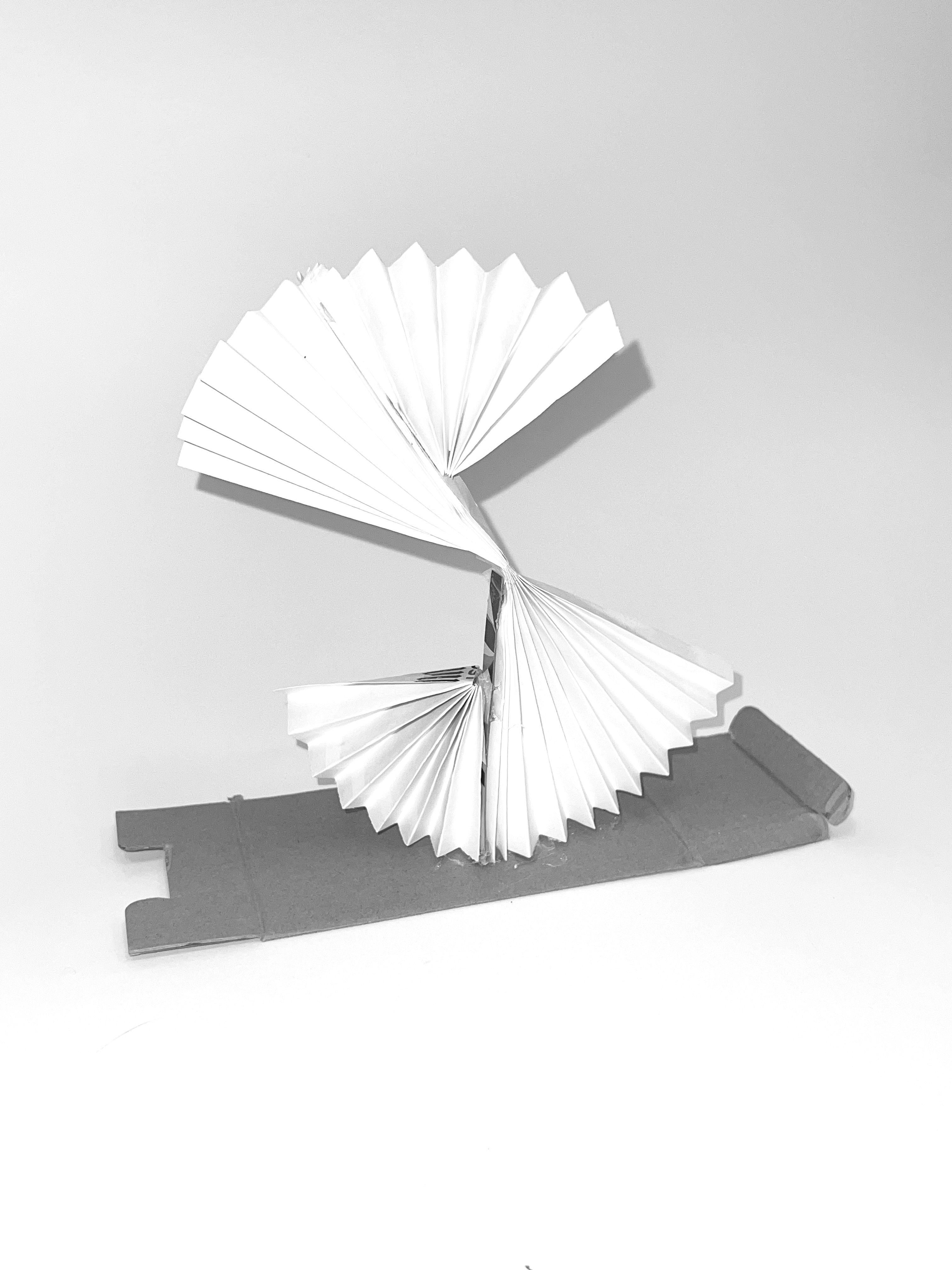
Safety pins became the reference point for this project given its symbolism—it was an important part of punk clothing/representing punk values, and although it was sharp and hard it could have really organic and elegant values when stretched and bent past rigidity. There’s a push and pull between elegance/regality (for the circular frame I referenced the Queen’s royal stamps) and punk, since Westwood was known for taking royal and structured historical motifs and flipping them in her own messy style. Read more about my process here.
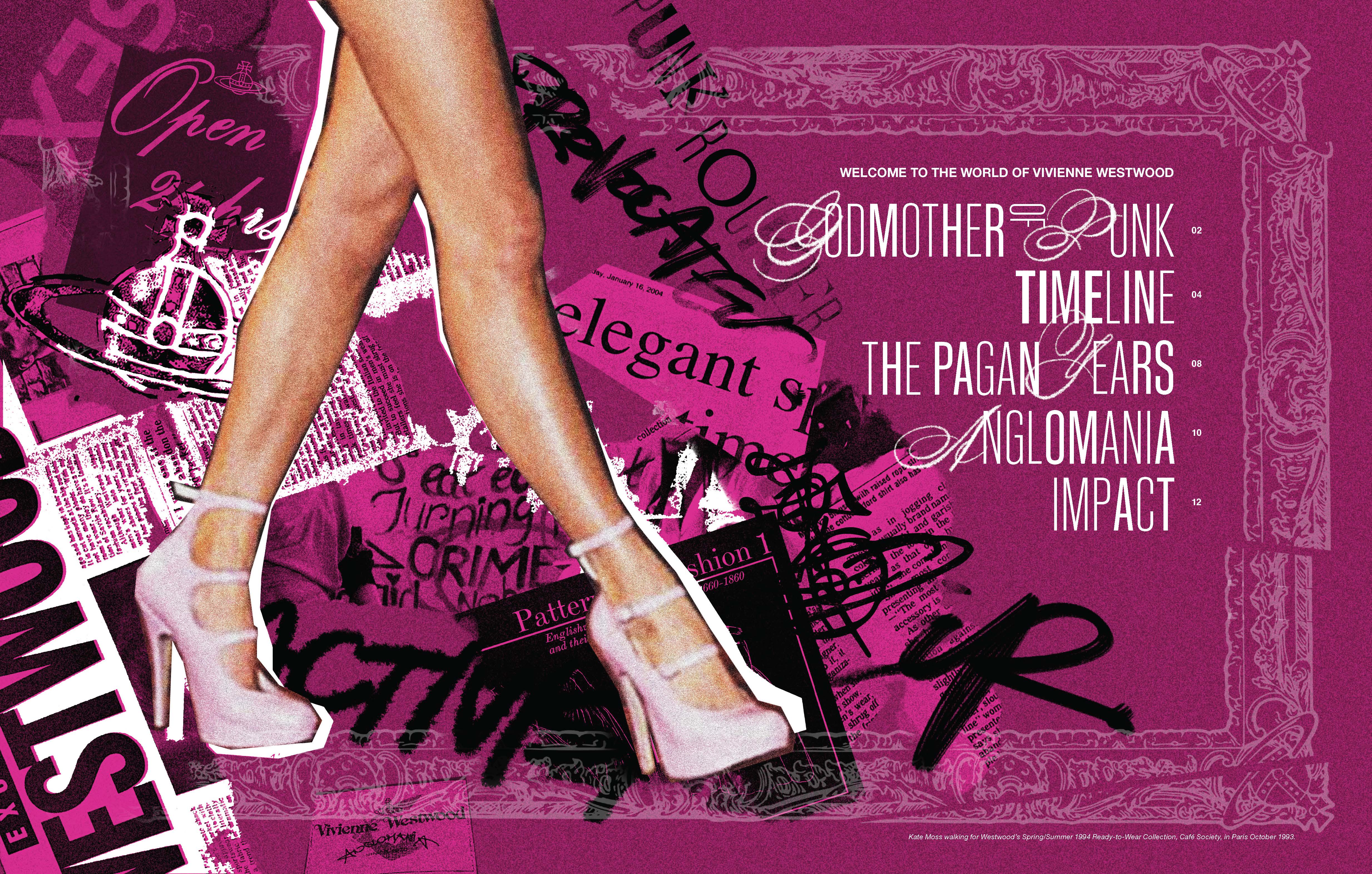
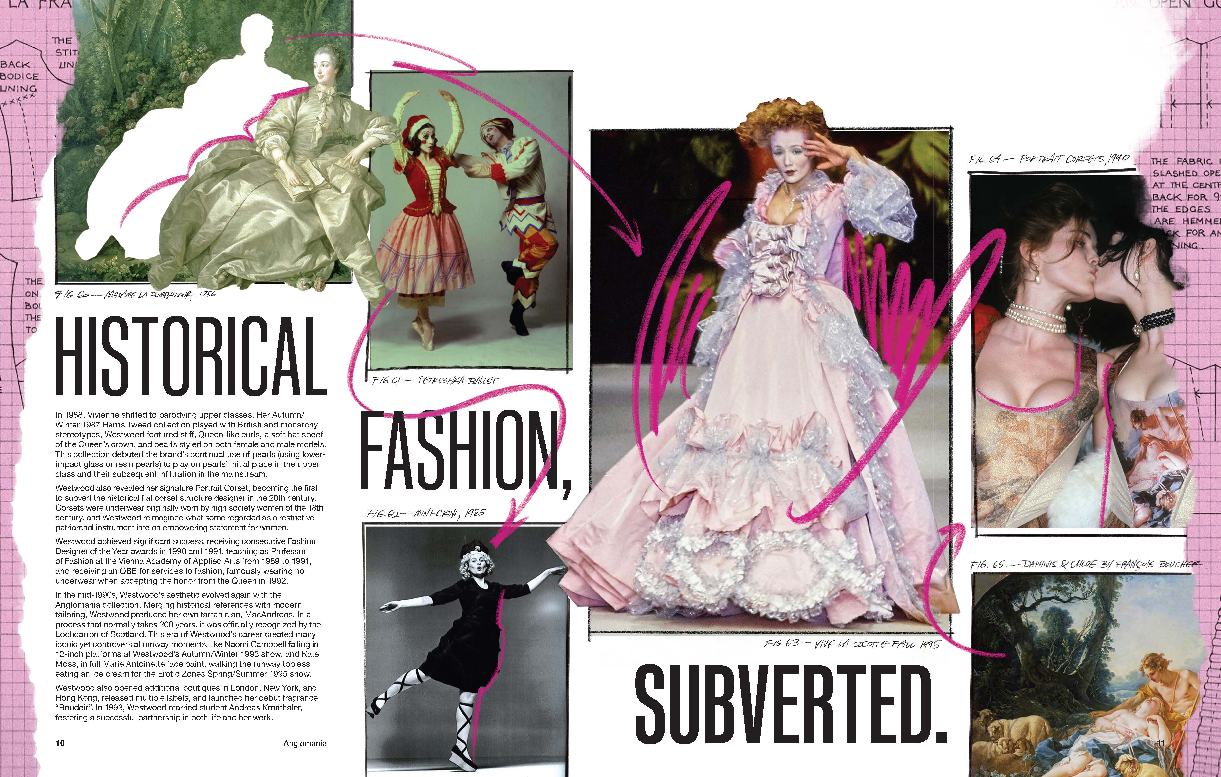
Asset 3: Booklet
Cataloguing Westwood’s work and life in seven spreads. View my full process here.
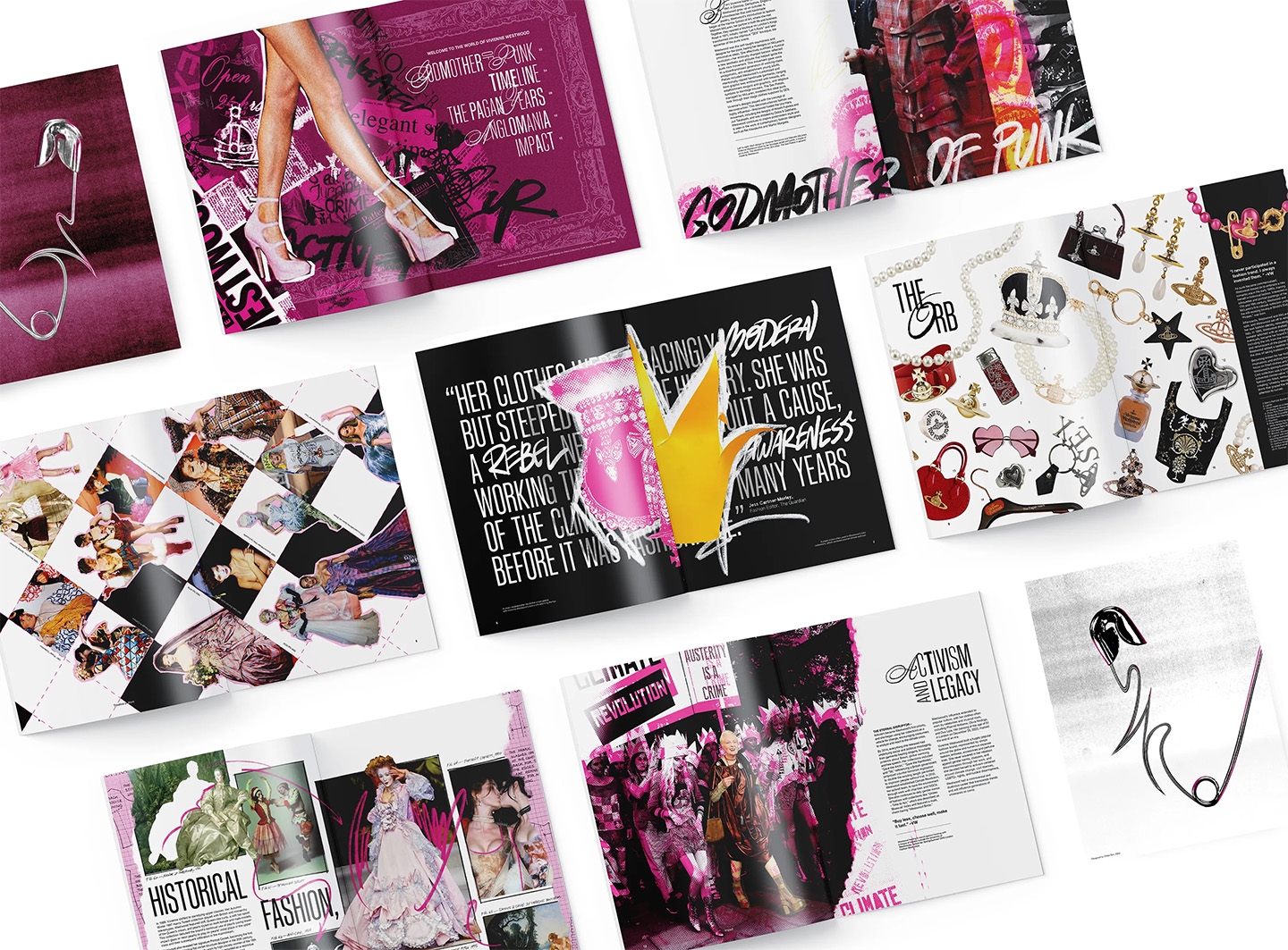


Click to flip through the booklet!


Asset 4: Interactive App
![]()
![]()
![]()


Your Move.
Timeline ········· 6 weeks
Tools ······ Adobe Illustrator, Adobe Photoshop, EPSON printers, cardboard pillars, sand
Role ······· Brand Design, Asset Creation
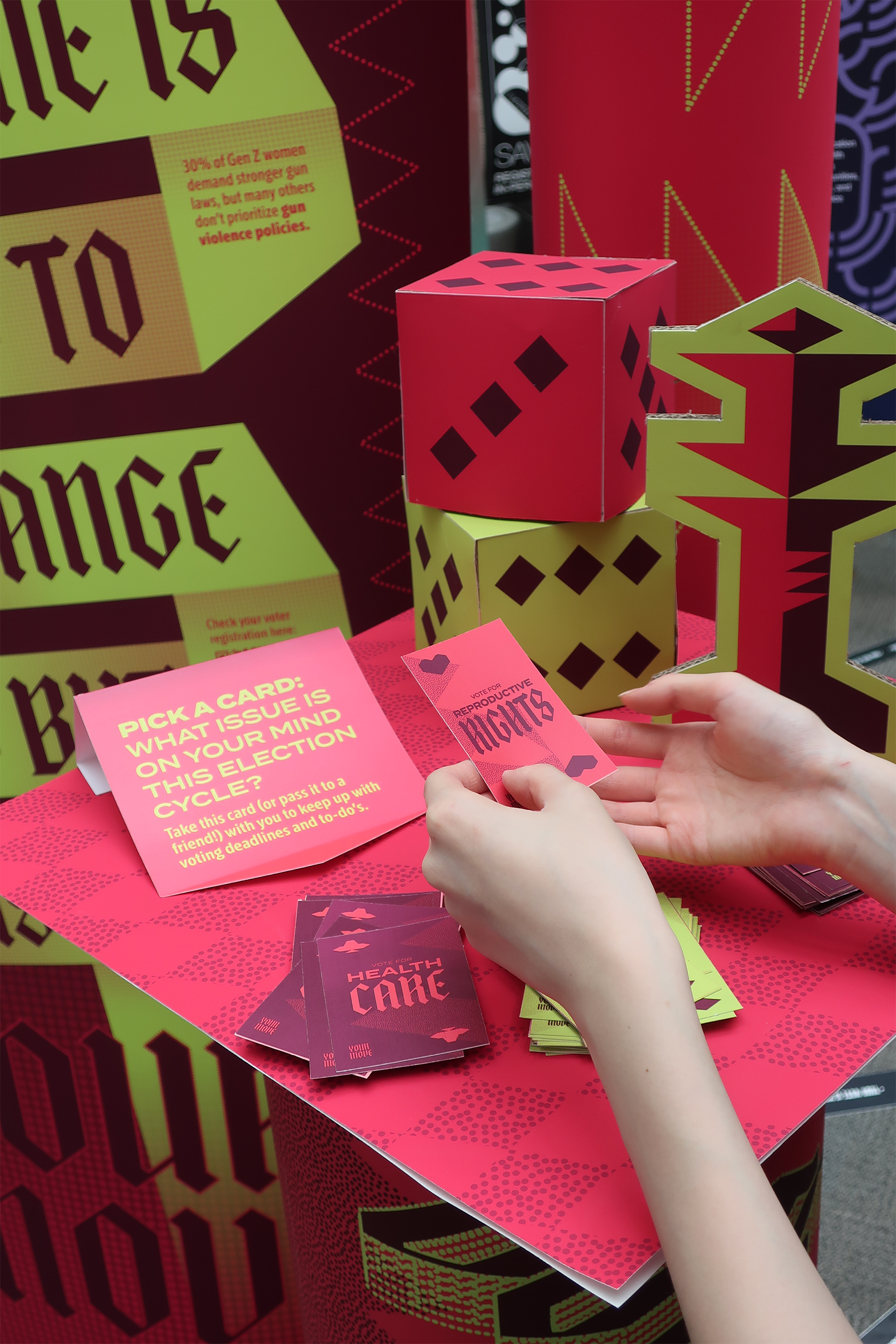
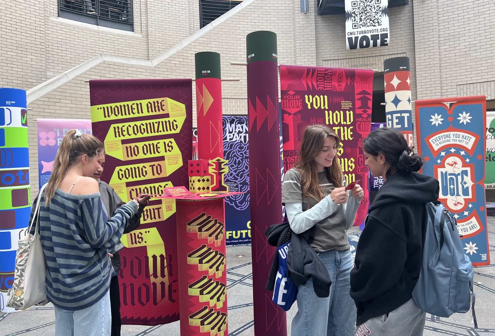
A voting campaign geared towards Gen Z women, empowering them to make their move by directing them towards campaign education resources and registration. The visual system focused on using one triangle to create an entire identity out of the shapes that could be formed with them.
Tools ······ Adobe Illustrator, Adobe Photoshop, EPSON printers, cardboard pillars, sand
Role ······· Brand Design, Asset Creation
A voting campaign geared towards Gen Z women, empowering them to make their move by directing them towards campaign education resources and registration. The visual system focused on using one triangle to create an entire identity out of the shapes that could be formed with them.


One shape defines the system.
This isometric grid allows graphics to shift from 2D
to 3D, and informs the hero font: a Blackletter that echoes these angular forms.
![]()
to 3D, and informs the hero font: a Blackletter that echoes these angular forms.


Framing the female vote as empowering, intelligent, and capable.
This installation incorporates game/chess themes while providing real resources for candidate policy education and registration.
Viewers can spread the message by taking cards with important dates and sporting vote-related stickers.
This installation incorporates game/chess themes while providing real resources for candidate policy education and registration.
Viewers can spread the message by taking cards with important dates and sporting vote-related stickers.
Posters

Stickers

Interactive Card Element

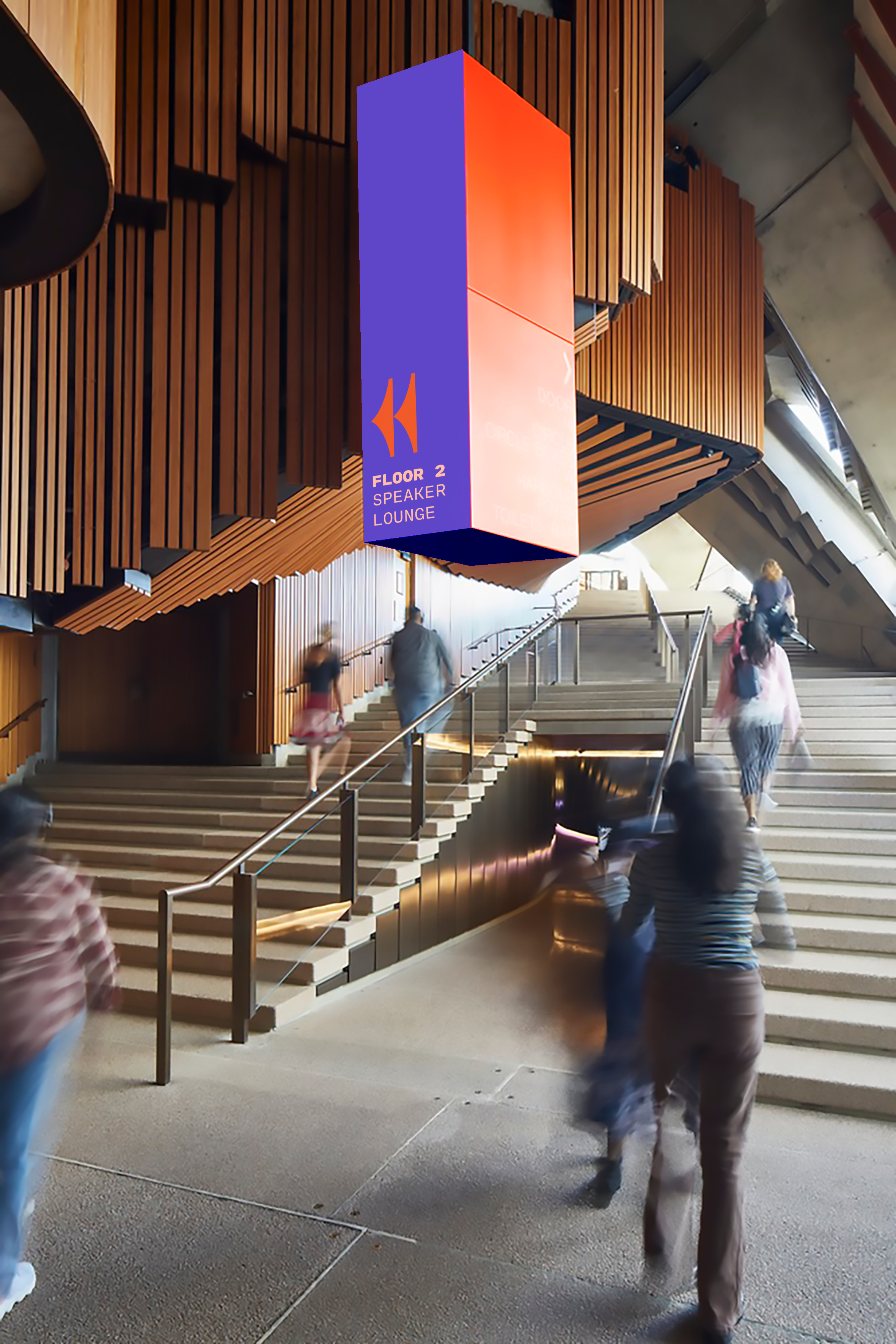
A Typeface for SEGD Sydney
Timeline ········· 4 weeks
Tools ······ Physical prototyping, Adobe Illustrator
Role ······· Type design, brand direction
A custom typeface and brand identity for a theoretical Society for Experiential Graphic Design (SEGD) conference held at the Sydney Opera House in Sydney, Australia in 2025.
Tools ······ Physical prototyping, Adobe Illustrator
Role ······· Type design, brand direction
A custom typeface and brand identity for a theoretical Society for Experiential Graphic Design (SEGD) conference held at the Sydney Opera House in Sydney, Australia in 2025.
A typeface reflecting the Sydney Opera House
After studying the architecture of the sails of the Opera House and how they reflect Sydney’s connection to the water, this typeface reflects that shape language through the arches of both the forms it is built of, and the negative space the letters leave behind.


A corresponding brand system that combines punchy color with lines full of movement, taking typeface elements and giving them new meaning.


Initial physical prototypes and sketches celebrate fluidity and the intricate lines found on the façade of the building.